Heechaa Platform Case Study
- Heechaa Store
- 1399
- heechaa.com
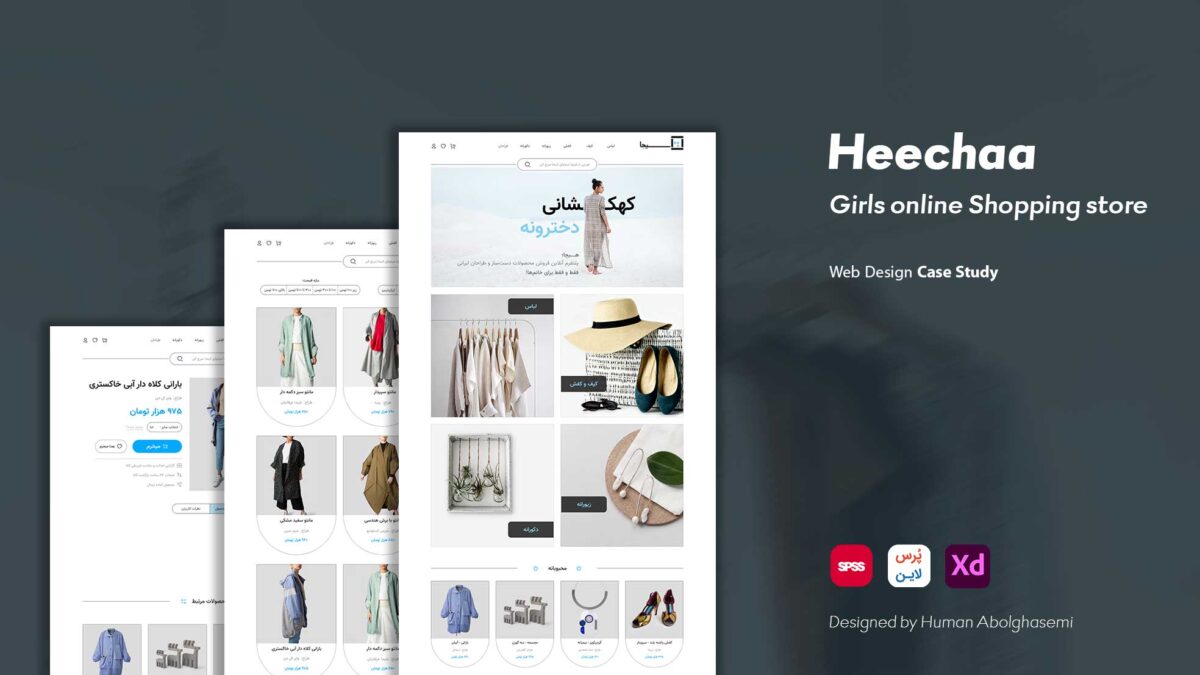
Step-by-Step UI/UX Process of Hicha Platform
Hicha is an online platform for women’s clothing and home goods, where each seller can list their products along with their store or brand name and sell directly on the site.
In this project, I was responsible for UI design, UX design, and banner design. Here, I walk through the entire design process from start to finish.
“If you want to see the full project details, you can –> click here <– to download the PDF file, which includes 54 pages of specifications, explanations, and the entire process described on this page.”
Complete UX Design Process
1. Competitive Analysis:
To understand the product’s position, get familiar with competitors, identify their strengths and weaknesses, and refine the UI/UX process while focusing on the target audience, it’s essential to conduct a competitive analysis.
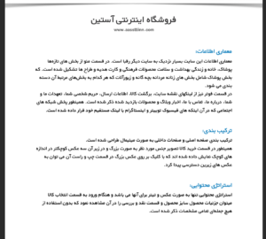
In this phase, I analyzed three stores — Astin, Ginza, and the international website Etsy — individually, examining their information architecture, layout, content strategy, color palette, and user interactions.
In this image, you can see part of the analysis for the Astin online store:
2. Survey
Questionnaire Design:
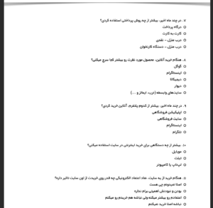
In this phase, we move into the user research part of the process. Based on the insights and data gathered from the competitive analysis, the user needs I encountered along the way, and biometric information, I designed a questionnaireusing the Persline tool.
During the process, I noticed some gaps and issues in the questions, which highlighted areas to pay closer attention to in the next iteration of the process.
In this image, you can see some of the questionnaire questions.
Questionnaire Analysis:
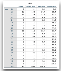
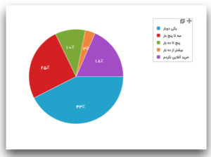
After considerable effort, 87 women responded to the questionnaire I distributed. Using the Persline analyzer and SPSS, I conducted a comprehensive analysis of the responses. You can see the results in the image below.
2. Persona:
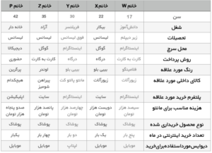
To transform these numbers and data into understandable insights, properly categorize the audience, create relevant scenarios, and build empathy, I developed personas for the project.
Based on their shared characteristics and needs, I ultimately defined five distinct categories, which you can see in the image below.
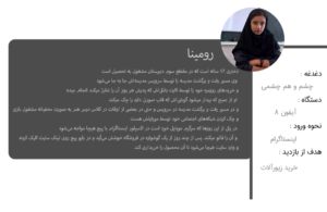
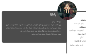
Then, to better connect with them, I assigned each persona a name reflecting their characteristics and needs.
In this image, you can see two of the five personas along with their user stories.
 ـــــــــــــــــــــــــــ
3. User Flow:
In the final part of the user research for this project, I designed the user flow along with a site map, illustrating the path a user takes through the Hicha website.
By the end of the design cycle, I realized that this flow was quite simple, and I plan to refine it in the next iteration.
 (Heechaa Site Map)
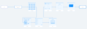
(Elaahe User Flow)
Complete UI Design Process:
Low-Fidelity Wireframe Design:
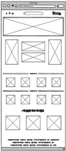
In this phase, we focus on designing the wireframe of the product, which illustrates the overall structure of the design.
The wireframe is created without any icons, precise spacing, images, or other details—its sole purpose is to provide a general understanding of the layout we are going to design.
For this project, I used Balsamiq to create the low-fidelity wireframe.
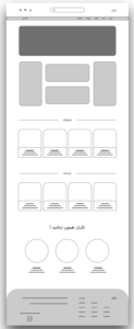
High-Fidelity Wireframe Design:
This design is created with higher detail, including elements such as spacing, icons, and other visual components.
Prototype Design:
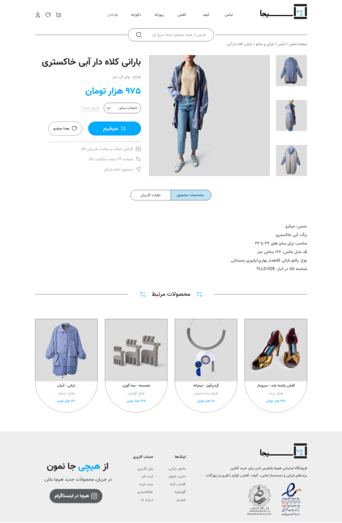
In this phase, the final design is defined. I designed three pages for this part:
-
Home Page

ــــــــــــــــــــــــــــــ
-
Category Page

ــــــــــــــــــــــــــــــ
-
Product Detail Page
